
9 Light Spring Color Combinations That Actually Work
Nine ready-to-wear Light Spring color combinations, why each pairing works, what to skip, and how to build outfits straight from your palette.
You already know Light Spring wants light, warm color. What nobody tells you is that a single flattering shade, worn alone, rarely makes a full outfit. The real question is which colors to put next to it, and in what proportion, so the pairing still reads as considered rather than accidental.
These nine combinations answer that question with real outfits rather than a swatch chart. Each one pairs a light, warm anchor with a second color, sometimes warm, sometimes a carefully limited cool accent, kept at the same low depth so nothing in the pairing outweighs your coloring.
Why Light Spring Combos Work
The full Light Spring palette covers what makes any single color work on this coloring: light in value, warm in undertone, never both pushed to an extreme. A combination adds a second rule on top of that. Both colors need to sit at roughly the same depth, so one piece never has to work harder than the other to hold its own.
That’s why almond blossom sits comfortably next to pastel lilac, but a saturated true-spring coral would fight it. Depth, not just undertone, decides which pairs earn a place in the same outfit. When a combination includes a cooler note, like pastel lilac or wispy blue, the warmer color still needs to lead. Think of it as a ratio: one color anchors most of the outfit, the second shows up in a smaller share, a blouse, a bag, a scarf, rather than splitting the look evenly down the middle.
9 Light Spring Color Combinations to Wear
Each of these pairings comes from a real outfit, not a theoretical swatch match, and each has its own board of further outfit references if you want more ways to wear it.
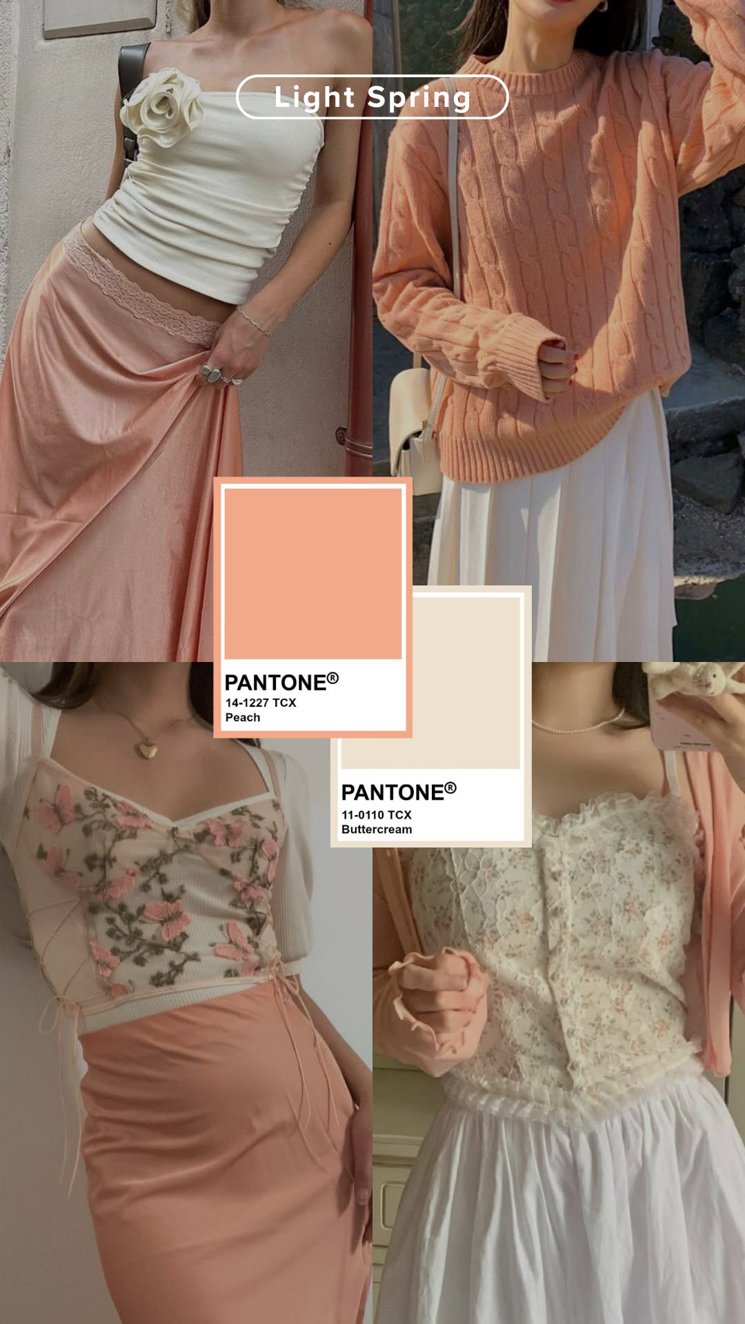
Peach + Buttercream
The easiest combination to start with. Both are warm, both are light, and neither competes for attention, which makes this the safe choice for a first Light Spring outfit.
See more looks on Pinterest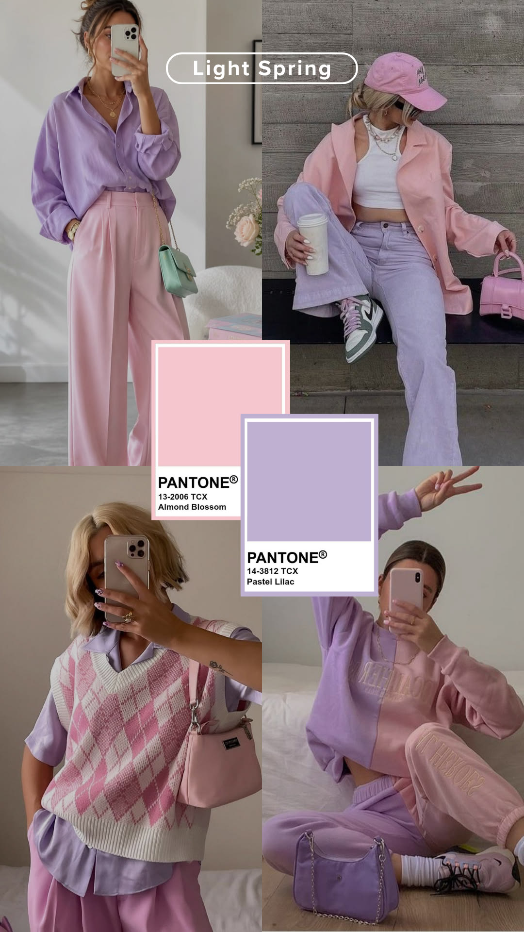
Almond Blossom + Pastel Lilac
Two of the softest pastels in the lineup. Wear almond blossom as the main piece and let pastel lilac show up in a cardigan or bag so the cooler note stays secondary.
See more looks on Pinterest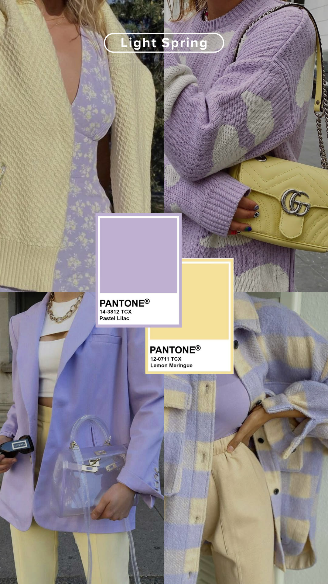
Pastel Lilac + Lemon Meringue
A cool-warm pairing that works because both colors stay equally pale. Let lemon meringue do the heavy lifting near the face and fill in with lilac below.
See more looks on Pinterest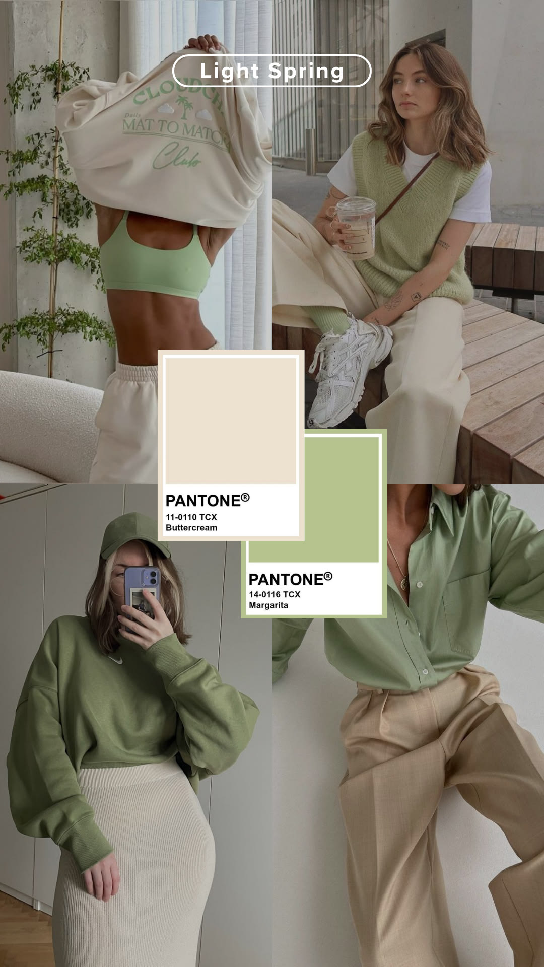
Buttercream + Margarita
Buttercream is the softest neutral in the lineup, and margarita's citrus green keeps it from going flat. Put buttercream in trousers or a skirt and let margarita live in the top layer.
See more looks on Pinterest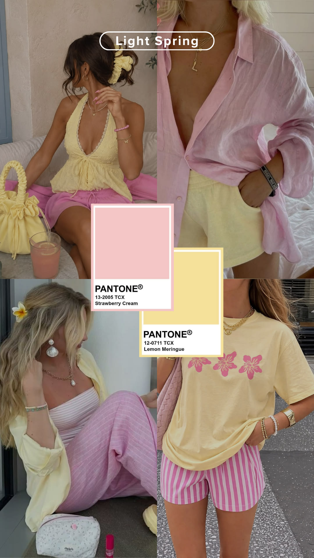
Strawberry Cream + Lemon Meringue
Candy-bright but still soft. Keep the proportions uneven, mostly lemon meringue with strawberry cream as the accent, so it reads as styled rather than costume-like.
See more looks on Pinterest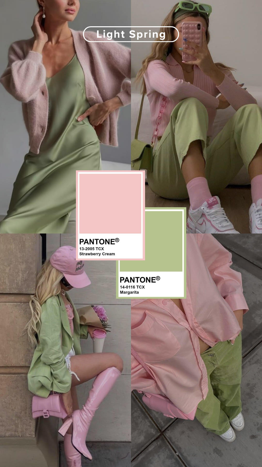
Strawberry Cream + Margarita
The most saturated combination in this set, and it still works because both colors are held to a lighter depth than their Bright Spring counterparts would use.
See more looks on Pinterest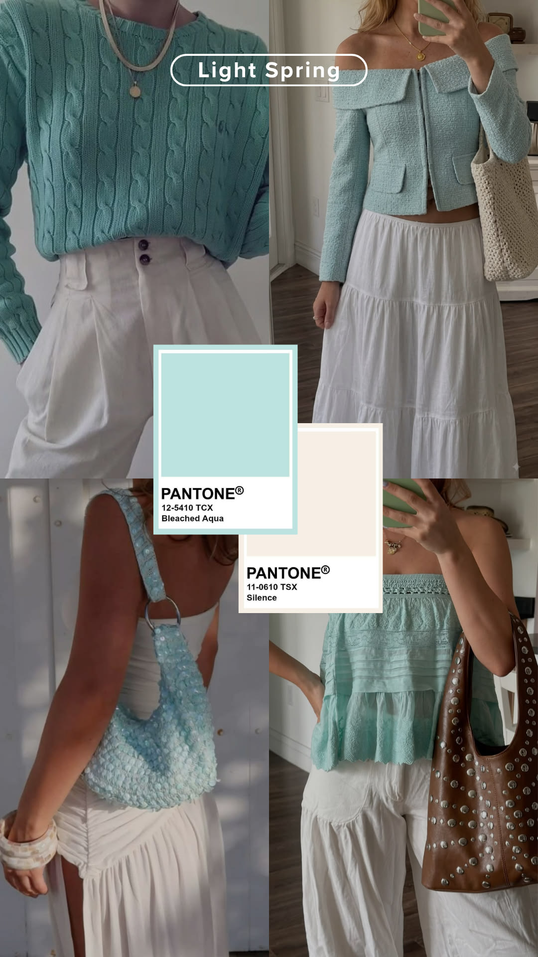
Bleached Aqua + Silence
Silence keeps this one grounded: a near-white neutral that lets bleached aqua read as a pop rather than a full outfit of pastel. Try aqua on top, silence below.
See more looks on Pinterest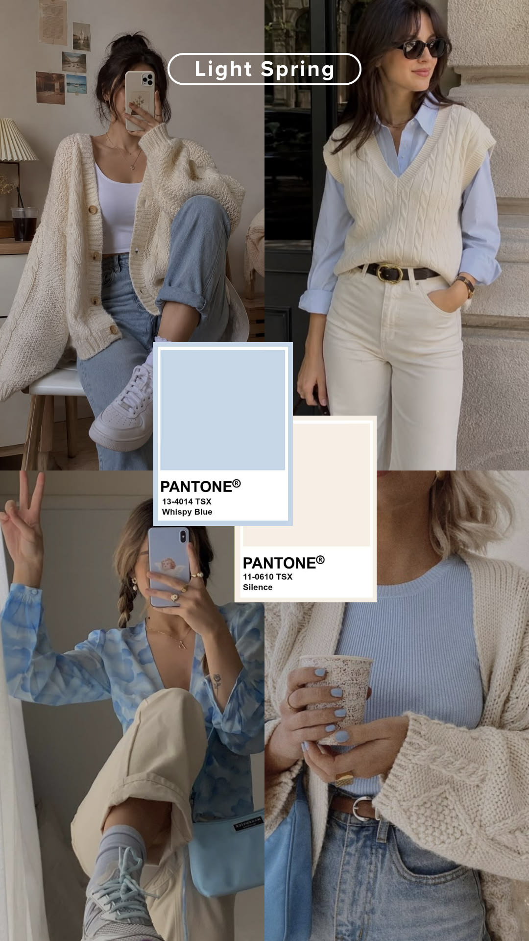
Wispy Blue + Silence
The coolest pairing here, and the one to test carefully. Keep wispy blue below the collarbone and let a warmer accessory, like gold jewelry, do the work near the skin.
See more looks on PinterestEvery board above sits inside the full Light Spring outfit inspiration collection if you want to browse all nine in one place.
What Not to Wear With These Combos
The same rule that builds a good pairing also rules out a bad one. Swap any piece above for something darker or cooler than its partner and the balance breaks.
True black is the most common mistake, usually as a “safe” bottom under a pastel top. It doesn’t read as safe on Light Spring, it reads as a much darker season borrowing this one’s colors for a day. Mustard causes the opposite problem: it looks close enough to buttercream or lemon meringue to seem interchangeable, but its extra depth and muddier warmth flattens the lighter color next to it instead of complementing it. Icy blue is the trap on the cool side, pale enough to seem like a safe stand-in for wispy blue or bleached aqua, but its lack of any warmth fights the golden undertone the whole combination depends on.
How to Balance the Pairing
Getting the colors right is half the outfit. The other half is how much of each color you actually wear.
Let one color lead
Aim for roughly 70/30 rather than an even split. The anchor color carries the outfit; the second color shows up in one piece, not the whole silhouette.
Keep prints to one color story
If you add a pattern, pull it from the same two colors already in the outfit rather than introducing a third. A busy print undoes the calm this palette is built around.
Finish in gold, not silver
Soft gold jewelry ties every combination back to Light Spring's warmth, especially useful when one piece in the pairing leans cool.
Related Reading
- Light Spring Color Palette: The Complete Guide covers the full neutrals-and-brights palette these combinations are built from, plus what to avoid in more depth.
- Light Spring Color Analysis is the full pillar page for the season, with traits, metals, and celebrity examples.
- Season Guide lays out all twelve seasons if you’re still narrowing down which one is yours.
- Warm Spring Color Analysis covers the deeper, richer neighbor that shares Light Spring’s golden undertone but can carry more saturation.
- Light Summer Color Analysis covers the cooler, rosier neighbor that shares Light Spring’s pale, low-contrast build.
FAQ – Light Spring Color Combinations
What is the easiest Light Spring color combination to start with?
Can Light Spring pair two brights together?
What colors go with peach for Light Spring?
Is pastel lilac too cool for Light Spring?
How do I keep a Light Spring outfit from looking washed out?
What's the best way to wear a cool-leaning pastel like wispy blue without breaking the warmth?
Discover Your Best Colors
Take a quick quiz and get AI-powered seasonal color analysis with personalized recommendations.